Off the Runway and Onto Your Walls
Even though NYC Fashion week is coming to a close, you don’t have to say goodbye to the styles. We decided to take inspiration straight off the catwalk and onto our walls! Take a front row seat to style with these runway inspired rooms.
Editorial Space
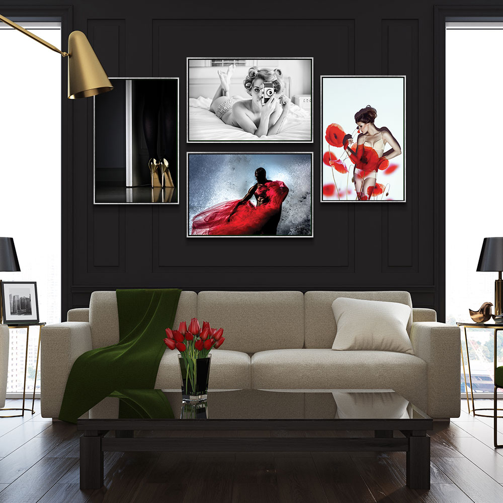

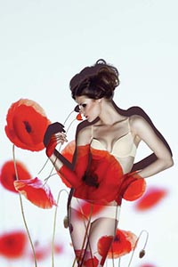
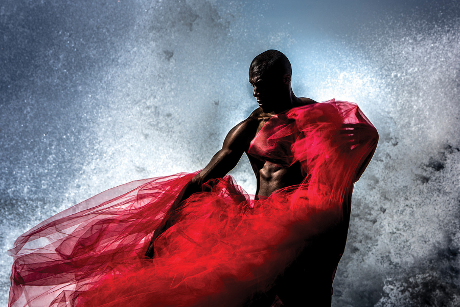
NYC Fashion Week can make you long for the glitz and glamour, wishing that you were front row at the biggest show or backstage at an editorial photoshoot. We decided to take that longing and desire and turn it into design inspo! We created a gallery wall featuring four of our favorite editorial photographs that combine edge, glam and fashion. Photography can be a tricky medium to decorate your house with, but when done correctly, it can make a show-stopping room. We decided to stick with neutral colors (black, white, gray) and bring in hints of color to make the wall pop. Whether your eye is first drawn to the poppies in marinastudio’s “Red,” or the mesmerizing flow of red taffeta in Peter Müller’s “Fire And Water,” you are drawn into the luxe and glamour of it all. Adding subtler pieces like Erik Schottstaedt’s “Golden Eyes” and Keane-Eye’s “A Chick, A Click, And A Curl” bring the whole wall together. We decided to bring an extra bit of glam in by pairing the photos with silver floating frames.
Hint: Four photos not enough? Longing for more? Try mixing and matching different sized canvas photos on the wall and sprinkling in floating frames here and there. The randomness of the frames and edgy style of the photos creates a trendy fashion forward room anyone would be jealous of!
Runway Trend – Summit
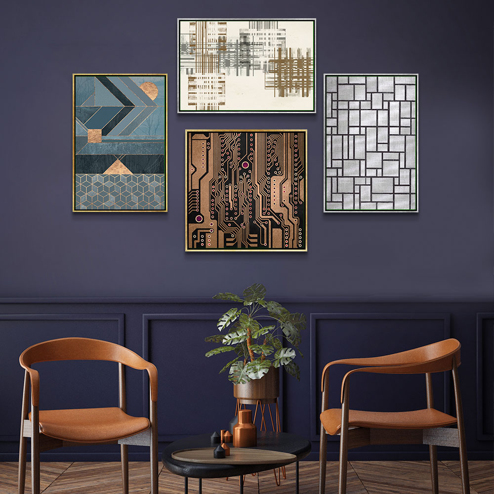
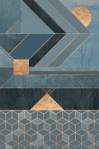
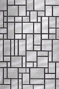
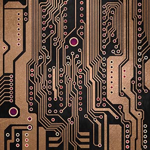
We turned to none other than leading trend forecaster, Fashion Snoops, to see what Spring/Summer ’19 trends we could envision on our walls. According to the leading experts, the Summit trend is all about the woman who is on the quest for peak achievement. Think Sheryl Sandberg: innovative and technology driven. Her wardrobe exudes power and we wanted to transfer that power onto our walls. Key prints seen on the runway with this trend are plaids, blocking and even code. Colors heavily featured are golds, grays, greens and blues. We combined all of this into one complete gallery wall. We wanted to pick art that was streamlined and inspired by technology. Sometimes it is OK to go literal with your trends like we did with “PCB III” by Elisabeth Fredriksson. While other times, it can be fun to get creative with how you interpret the trend. We were inspired by the colors of this trend and the message behind it when choosing “Nordic Blue” by Elisabeth Fredriksson and “Composition in Grey, 1919” by Piet Mondrian.
Hint: Like the motif of the trend but not fan of the colors? Not a problem! The great thing about trend and design is that you can make it unique to you. Start by finding a print that features the design elements you like and then create the gallery wall around it. Pull from colors off of your initial print to help build the rest of the gallery.
Runway Trend – The Valley
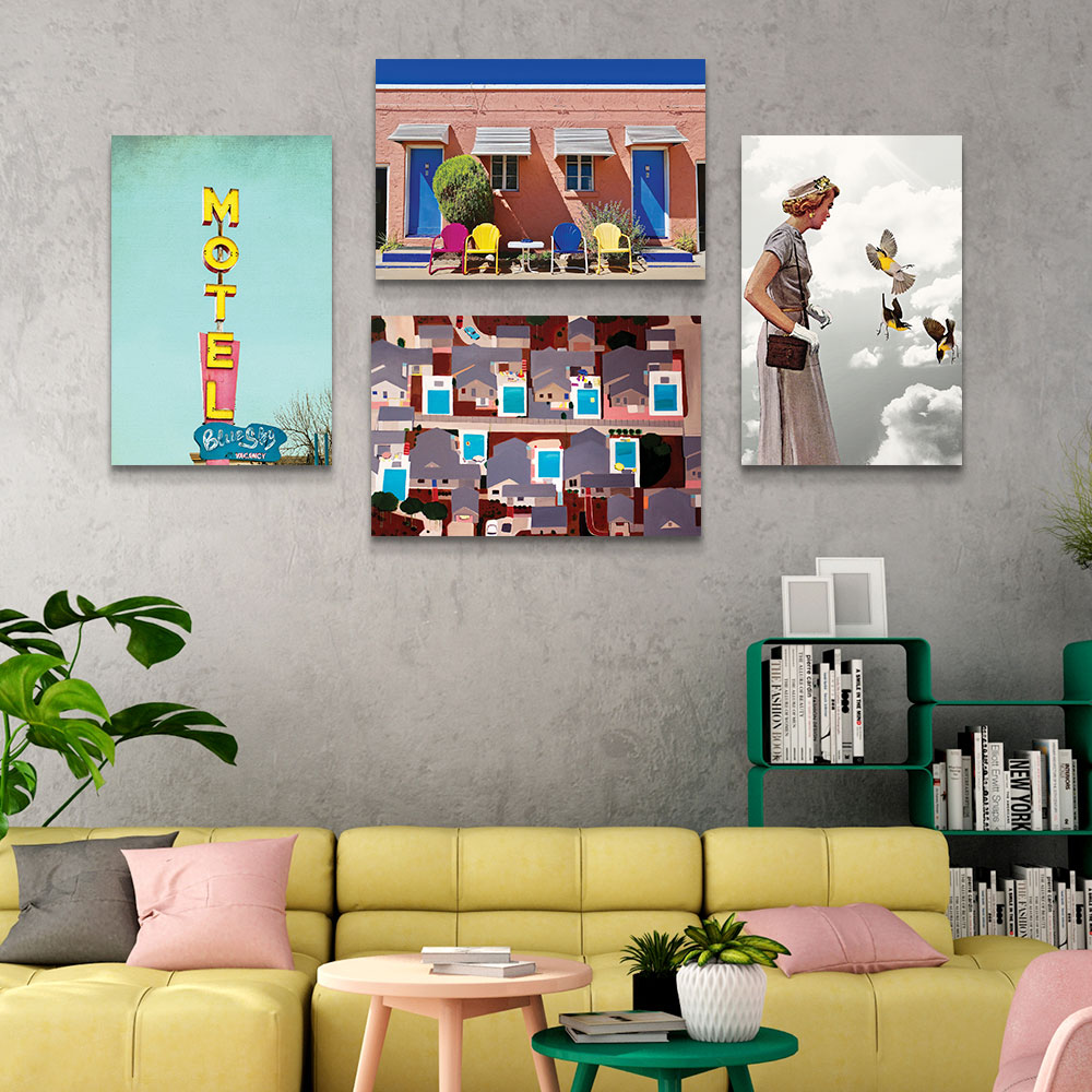

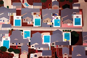
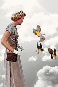
The Valley was the second trend to come out of Fashion Snoops that we couldn’t take our eyes off of! This fashion trend describes it as a woman viewing life through rose colored glasses. Think: a former city-dweller who has relocated to suburbs; a “domestic goddess.” But her life extends far beyond pool parties and PTA meetings. She is all about Pinterest-worthy crafts and family road trips. 50’s and 60’s fashion is her style inspiration and pastels are her go to. While she may exude perfection on the outside, she is breaking down on the inside. She is the perfect Stepford wife just waiting to burst at the seams. For this room, we took inspiration from the pastel color palette and played with the idea of something seeming perfect on the outside but not seeing the inside. Images like “Identical Pools” by Toni Silber-Delerive show off the seemingly perfect suburban life, leaving us with only a bird’s eye view; never getting close enough to see more. Pairing with the retro scenes and fashion of the 50’s and 60’s with “Lady In Grey” by Heather Landis, “Motel Doors And Chairs” by Susan Vizvary.
Hint: Create your gallery wall with fine paper prints in white frames to make the images really stand out. The brightness of the pastels paired with the stark white of the frame will demand attention.
Which of these NYC Fashion Week inspired rooms is your favorite? Let us know in the comments! If you’ve tried to incorporate these into your home, make sure you share them with us on Instagram or Facebook, and tag them with #iCanvas.
